


Jared Spool once wrote a famous article (based on a true story) about how tweaking a single button on an ecommerce platform brought in an additional $300M in revenue.
If there’s one thing we might learn from this case study, it’s that online forms are really important, and yet are oftentimes neglected by designers and marketers alike.
No matter the size of your ecommerce business, putting in additional effort into optimizing your online forms is certainly going to be a worthy investment.
Get the basics right
Online shoppers like simplicity. That’s one of the reasons they choose to shop online instead of going to a physical store. So when it comes to your online store, you need to make sure the shopping experience is clear and simple, allowing them to checkout without any difficulty.
The customer journey should be seamless from the moment they land on your website through to the checkout. They should be able to search for products easily, add them to their basket and then checkout and pay in a very clear way.
It sounds incredibly basic, but it’s surprising the number of ecommerce sites that get this wrong. Not only does this process need to be simple via a browser, but it should be simple, if not simpler, from a mobile device.
Overcomplicating things won’t earn you any fans. Make it easy for customers to find and buy items, and keep your menu items simple to understand. It also helps to make your search bar is visible.
If a customer knows exactly what they want (like a repeat customer usually would), then the option for a fast checkout is crucial. Some users won’t want to register for an account and simply rush through to payment, while others will appreciate the option of saving their contact details and payment information. The choice is what’s important here, so try to be flexible with your customers.

Source: Nike
Providing a guest checkout makes things simple for customers in a hurry, as well as for those who are wary of creating new accounts and passwords online. No matter what path the customer takes, make the order easy to track and provide progress and shipping updates.
Make sure your forms truly represent your brand
Brand consistency is a must for your business. If your branding is all over the place, how can you expect people to recognize it?
Making sure every inch of your website is consistent with your brand will not only help make customers trust you, but it maintains that professionalism and polish that sets you apart from your competitors. From your email sign-ups to your chatbot, keep it consistent.
Your online forms are a crucial part of your ecommerce site. Without them, customers can’t input their details, and you can’t complete those sales. Even if you’re using an integrated checkout tool, make sure you choose one that’s customizable to your store’s own branding.
Trust is precarious when it comes to online shopping, and the more you can do to keep it, the better your chance of success. A survey from Ware2Go has shown that 55% of consumers have bought from a website they’ve never bought from before, so if you’re looking to bring in new customers, then having a website that earns trust from the beginning is a must.
From using the right fonts to the right, consistent colors, these seemingly small things can make a big difference.

Source: ASOS.com
Keep things recognizable, and avoid having a checkout that leads customers elsewhere. Familiarity is important, and those visible page banners that enable a quick return to the homepage for a last-minute item can create a better feeling of trust amongst your customers.
Simplify your checkout process
Poor user experience accounts for 28% of shopping cart abandonments. If a checkout process is clunky, difficult, or takes pages upon pages to get through, they’re going to get irritated/confused and give up.
Your checkout process needs to be as simple as possible to provide the best user experience for customers. From having fewer pages to reducing the number of fields required to check out, it’s important to create a simple, stress-free checkout process.
The first thing you should do is conduct a review of your existing checkout process. How long does it take? How many separate fields are there to complete? Can elements be auto-filled? If there are fields there that are unnecessary, they need to be removed. Other fields can be simplified to make the process smoother.
You could even ask existing customers for feedback on your checkout process to help you tailor your form to their needs.
Navigating to your checkout page should also be simple. After a customer adds an item to a cart, you should give them a cue that enables them to go straight to the checkout or continue browsing, giving them the option to checkout immediately if they want to.
A simplified checkout process starts with the checkout page itself. Having a progress indicator will give an indication of how long the checkout process will take to complete, and help customers see their own process along the way.

Source: Urban Outfitters
You should also think about the layout of the checkout page. Keep it free from distractions—you don’t want to tempt customers away from that page with menus, search bars, etc.
Strip your checkout page back to help keep the focus on your customers. The aim is to get your customers to complete their purchase and not lead them toward other areas of your website that could stop them from finalizing the sale.
With a simplified checkout process, you should see an increase in the number of people who complete the process.
Add trust badges to your forms and website's footer
Don’t underestimate the importance of online security. This isn’t something you want to keep hidden behind the scenes; your customers want visible proof of your website’s security (and legitimacy). And the good news is that it’s easy to achieve.
One way you can boost your website’s credibility is to add trust badges to your website. Trust badges are a simple concept, but they help assure your customers that your website’s checkout process is secure.
Of the most trusted badges, Google, Norton and BBB are amongst the top. Logos of your payment options, as well as contact details for your business during payment stages, can boost confidence further in your website.
Your customers want reassurance that their payment information is in safe hands when they shop via your website. Demonstrating your security credentials, review scores, returns information and more are all ways to help build up trust. It’s reassuring to see logos for Visa, Mastercard, AMEX, PayPal and so on.
Remember to include trust badges in your website’s or online form’s footer too. This can give assurance to potential customers from the second they land on your website. It can also save people disappointment from going all the way through to the payment form and finding out their preferred payment method isn’t accepted.
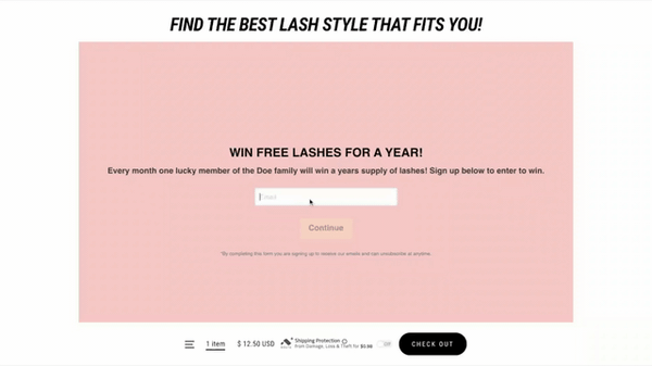
Use quizzes to gamify the online shopping experience
How can you use forms to enhance the online shopping experience? Through quizzes, of course! Quizzes can gamify online shopping, enhancing the user experience and adding a bit of fun, while also proving to be useful for collecting data.
A great example of a fashion website could be for someone looking to find their perfect party dress or LBD (Little Black Dress).
Through a series of questions, you can identify the shopper’s likes and dislikes, leading them to some item recommendations. This is a format that can work for different types of retailers, adding a fun twist to the shopping experience. Take a look at some other great examples of ecommerce quizzes.

Source: Fabletics
Ecommerce quizzes can help boost sales and engagement and are simple to execute. You could even take things a step further, building up a customer profile that provides recommendations and helps filter available items so they are more closely related to their tastes and interests.
It’s a strategy that works, with 91% of consumers stating they would be more likely to shop with retailers who provide them with recommendations of products that are more relevant to them.
Ecommerce quizzes can be used to fulfill all kinds of aims, but remember to make them optional for those that simply want to browse and buy.
Interested in learning more about building buyer profiles with quiz data? Check out our ecommerce personalization guide.
Summing it all up
Online forms are arguably one of the most important, yet tricky, elements of your e-commerce store. It’s important to take them seriously and keep on measuring and optimizing their performance.
Remember that your forms must be not only consistent with the overall design and branding of your website, but they should also extend its functionality, and help engage and convert your visitors into customers.
Vlad Shvets is a growth manager at Paperform.
